

Real Estate | Finance | Multi-Service
“We are an example of entrepreneurs, we fell, we got up, we invested, we bet on people, we followed our ideal and today we can say that we are better than yesterday and tomorrow we will be much better than today”
30+
Affiliate experts
15k+
Clients served
4.2M+
Impressions
SCOPE
Logo Redesign
ID System
Style Guides
Collaterals
MISSION
Terratino emerged as an innovative initiative dedicated to providing customized real estate services to the Spanish-speaking market.
To keep helping the Hispanic community in one of the most important investment decisions in one’s life. Terratino wants to position itself as the preferred choice for Latinos seeking home ownership.
OUTCOME
We redefined the brand, by generating a more friendly, approachable and consistent communication system, based on the values, objectives and purpose of the company, encompassing its visuals, as well as its messaging.
We redesigned the logo, developed a new design system, style guide, brand architecture, collaterals and finally a Brandbook where we captured the essence of the brand.
Nestled in the heart of the ever-evolving real estate landscape in the US is Terratino, a vision born from the minds of three visionary Hispanic entrepreneurs, who had recognized the disparities in housing opportunities for the Hispanic community, a community facing barriers like language, finance, among others that hinder their access to homes.
Located in Texas, Terratino emerged to bridge this gap, starting as a house search engine that swiftly transformed into a dynamic hub offering a spectrum of services around the real estate industry. Serving and connecting all participants in the home-buying process, the Hispanic community, often facing uncertainties in the housing market, found solace in Terratino’s commitment to providing tailored real estate services for them.
Our journey with Terratino began with a deep dive into their brand strategy, developed by its CMO, who had defined his and the shareholder’s vision for the company, that through extensive research and analysis, pieced together a comprehensive guide that laid the foundation for the future of the company.
The initial phase involved a critical assessment of the existing brand—what worked, what needed improvement, and what elements were worth preserving, to get a clear understanding of the brand’s current state, and so we embarked on a process, of redefining the brand.
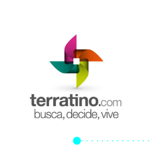
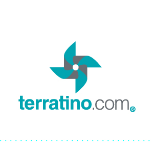
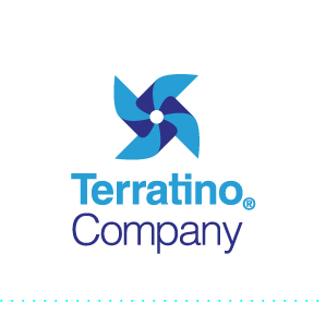
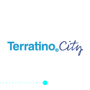
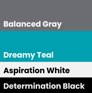
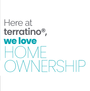
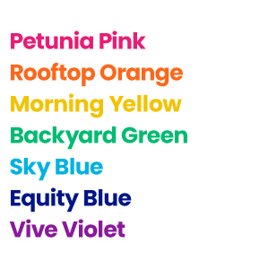
Once this overview of the brand has answered some questions, we could start the design process, refreshing Terratino’s visual identity elements, starting with its logo, a new and expanded color palette, and typography with its corresponding system, with these basic elements we then were able to expand to a design and identity system that allowed us to further the identity creating a style guide, as well as the overall experience and communication of the brand, that now lives in a brandbook that contains the soul and mind of Terratino.
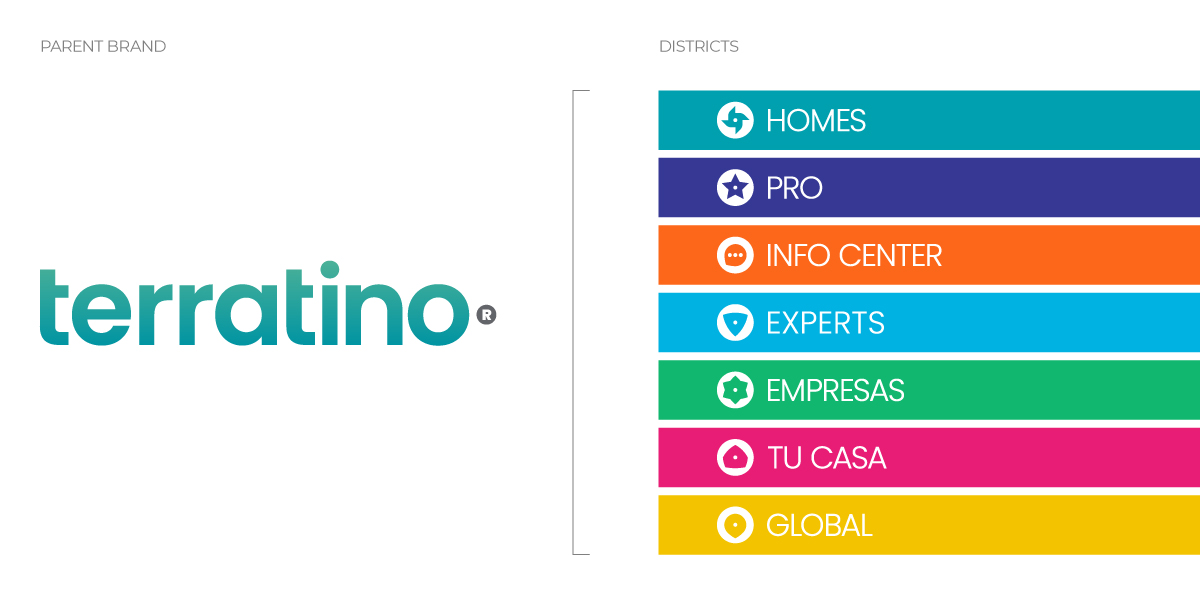
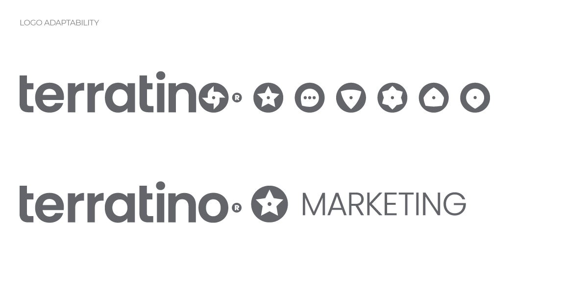
Terratino is now a multi-service company, that manages several sub-brands, we opted by adopting a branded-house identity model, where each service (sub-brand), or district as we called them, is an adaptation from the parent brand.
To expand the brand’s expression, its own illustration style was developed, one that would help express more abstract thoughts and ideas, and one that reflect the values Terratino lives by. Started by finding inspiration on how we’d like this asset to communicate, we decided on a flat illustration style as a base, then evolved the initial concept, maturing it into a style that uses free hand look as way to communicate freedom, simplicity and making it look imperfect to reflect the nature of the uniqueness of each case Terratino handles.
The culmination of our efforts was a brand that went beyond aesthetics—it became a living, breathing representation of Terratino’s mission. The redesigned logo, identity, and overall brand experience now reflected the company’s dynamic and ever-evolving nature. Vivid colors, bold typography, and carefully curated photography all contributed to a brand that felt approachable, relatable, and deeply rooted in Hispanic culture. The illustration style, with its imperfect yet intentional design, added a touch of authenticity and simplicity, resonating with the target audience.



Want to develope a grand brand too?
© 2023 Creatorium®. Read our Privacy Policy
Hello!!!
I would love to know more about you!!!